Pages

Wednesday, May 30, 2012

The Illustration Project Update

   On the advice of a friend (thanks Cindy of theslumberingherd) I decided to add some text to my latest illustration and enter it over at Illustration Friday for this week's topic, "Hurry". (This is just for fun, not available as a print or anything.)


    Here is the latest additions to the Illustration Project. This is a 2-page spread for pages 11-12. If you've been following along you may have noticed there's no pic for pages 9-10. That's because I noticed an error in the text that affects the illustration. I infoed the author and am waiting to hear back as to how to proceed. In the meantime I skipped ahead to this one. I'm so glad I did. For some reason, coloring this one just made my heart happy. I made a few unusual color choices that (fortunately!) worked out beautifully.

   My favorite part, both in color and execution, is the tree. I love drawing trees. There is just something about them that speaks to me. I see faces, torsos, arms and legs, emerging from their textured bark. I'm fascinated by the way they are rooted so deeply into the earth, yet seem to reach for the sky.
   
  Anyway! I drew this tree with flowing lines reminiscent of Art Nouveau, a style I admired as a kid in old-timey illustrations. It often makes its presence known in my drawings. I decided to depart from the usual browns, as I was mysteriously drawn to the Black Cherry pencil. I mean, who wouldn't be! The name alone is worth a second look!


   Once outlined in Black Cherry I rummaged in my pencil box to find a complimentary second color. I had colored all of the characters by then and wanted to avoid anything that matched what they were "wearing". That eliminated the Sienna family as Monkey Boy had pretty much appropriated it. Another choice might have been Mulberry, but the charming nightingale decided (rightly so) that it was her color. So went the Lavender and Pinks to the little owl, and the Ginger Root (one of my faves) to the feathered costume her friend is wearing.


 Then, a light Jade Green pencil found its way into my hand. At first I dismissed it and tried to put it back, but it just wouldn't go! I made a mark of Black Cherry on the white expanse above the illustration and laid down a smudge of Jade green next to it. H-m-m-m.


   I decided to take a chance on it. So glad I did. I think it turned out beautifully. 

   Well, that's all I have for now, except for the obligatory apology for the quality of my photos. if you click on the pics you should be able to get a bigger image that (hopefully) makes them a little clearer.

   Back to the drawing board...

Monday, April 30, 2012

Wishing for a Photographer!


I'm wishing for a photographer, much in the way a dreamy-eyed princess once wished her prince would come!


"Why? " you might ask - or then again maybe not, if you've peered and peered at the picture above till your eyeballs fell out. I didn't think it possible for my photog skills to get worse, but here's the proof. It's really too bad, cuz this new illustration is really quite good. No, really! (Sigh.)

Here's 2 more attempts - each so equally bad that I couldn't decide which to delete. Thank your lucky stars you don't have to look at the other five I tossed. What do you think - is one of these better than the other? (Not a trick - I honestly couldn't tell.)


And then there were the many (many, many) close-up shots I attempted. Not sure if I was bothered more by the blurred images or the glare. Only 2 made it out of Paint.net.


Yup. These are the keepers!

So, since you might be having trouble figuring out what exactly is going on in these pictures, here is a written explanation. Because, apparently not every picture is worth a thousand words. 

The illustration depicts the joy to be found in a good mud-wallow, as evidenced by the mellow expressions on Mom and Baby Hippo's faces. Obviously these are not the Boat-crushing Hippos of National Geographic fame. They're probably more closely related to the Disney-Fantasia-Hippo-ballerina side of the family. Mom Hippo is a delightful blend of Cerulean Blue, Pink Rose, Lavender, and a soft layer of White. She has  lovely China Blue eyes behind those curly Violet lashes. 

Baby Hippo's skin is covered in tiny, frothy pinkish-purple bubbles. She kinda reminds me of bubble-gum. (Yeah, that does sound a little weird. Too late! I stand by my words!)  She also has HUGE, Violet,  the-better-to-mesmerize-you-with eyes.

Two of the 4 children are likewise enjoying the mud, one riding on the mother hippo, and the other (a little girl) sitting on the mud-bank in the foreground, making a mud-castle with a bucket and shovel.

On the second half of the 2-page spread, the other kids are helping prepare a refreshing snack of wriggly bugs for a pair of ibises (ibisii?). The ibises/ibisii wings are boldly patterned in Deep Purple, Orange and Canary Yellow. Why not, says me! They pop out nicely against their pale lavender torsos and compliment their Royal Purple heads and glowing yellow eyes! One ibis perches on a tree trunk, reaching down into the mud with her beak, searching for a yummy treat. Beside her, one of the boys helps by reaching down with a green twig. A cutaway look beneath the surface of the mud shows a little burrow, housing a number of six-legged snacks, one of which unwittingly crawls up on the child's stick. I colored this cutaway view carefully, using lighter tones of brown such as ginger, sienna and light umber, and adding teensy-tiny pebbly texture so that it would stand out against the chocolatey dark umber of the surrounding mud. I also filled the underground chambers with a creamy yellow light and colored the insects bright blue so they wouldn't disappear. Ah, Artists' License! It's a beautiful thing!

In the foreground of page 2, the other ibis is served a tasty snack from a leaf-bowl, held by the other boy.

The kids faces are not at all as blurry as they appear. They're actually fairly detailed with eyes and noses and whatnot. A couple of 'em even have cute little kid smiles.

I used to hate doing backgrounds. Now, I love 'em. I really enjoy trying to do something interesting that has a little pop and doesn't just lay there all flat and boring. Something that speaks up; "Hey! I'm not just a prop for all those other characters. I've got a story too, you know!" I really like this one. It's kinda fun with it's long, wavy, bright-green towering grasses and mysterious flashes of dark-green and yellow stripes. Anything could be hiding in there!

OOPS - as a friend of mine says when she dashes off one of her "quick notes" - wrote a book! Didn't mean to! Hope you didn't mind looking at my not-so-good photos of my (IMO - LOL) awesome illustrations! Hope the explanation helped! Please don't be put off and stop by again! :)

OH! And if you click on the pictures you should see a larger view, which helps. 

Monday, April 9, 2012

Illustration project - pages 5-6


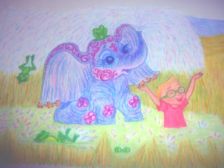
 A little more progress made on the illustration job. Here are pages 5-6. Photos really don't do it justice. (Sigh) I really like how the baby elephant turned out, with her lovely mulberry tattoos and golden earrings. The giraffe is a different take on the hottest item in my Etsy shop, a Purple Giraffe (seen below). I didn't want it to be exactly the same, so I went with a side view and a pinker color scheme. As it's a 2 page spread which the author wants presented as one scene, it's sometimes difficult for me to figure out how to illustrate both of the ideas seamlessly. It has to make sense as a whole scene, yet each also needs to stand out on its own. They also need to be large enough for the individual details to be seen. It's an interesting challenge on the perspective. This time I went with showing just part of the giraffe in the foreground of the 2nd page, so I could still do a full figured elephant.


Friday, March 23, 2012

Illustration Project: Pages 3-4

  Sooooo much work to do on this project! It takes me about 8-10 hours to do a completed drawing of this size, especially since I decided I didn't want a hint of space showing. Lots of color-layering and blending. I'm glad I chose a good sturdy paper, cuz it's gettin' a workout and , so far, hasn't worn thin under the pressure. It's Canson 70lb Drawing Paper (14 x 17). I chose it because it had e/g I was looking for, advertising itself as "suitable for final drawings, fine surface, erases cleanly, blends smoothly". I must say it lives up to its hype!

I had a bit of trouble drawing this one as the author was set on having an indoor/outdoor scene all-in-one, with the outdoor part being seen through a picture window. I had originally wanted to do it all in a garden, with giant sunflowers. It was hard doing it in such a way that the window wasn't disproportionately large for the room, yet large enough to display the characters outside. The dimensions are a bit odd (16.5 x 6")  so it presents a challenge. But I think it worked out well in the end, and I did manage to get the sunflowers in!

Some nice features (IMO) are the 2 kittens under the toybox. It's hard to see (thanks to my not-so-great photography and the paper being too large to fit in my scanner) but the little pink and fuchsia kitty has a cute curlicue pattern to its coat. I love the look of giving just a hint of them, with the focus on their kitten paws darting out to grab objects lying on the floor. Just the way real kittens do.


As usual, per my somewhat meandering process (I think the kinder term is "Organic") I never have all of the colors thought out completely. I sorta start somewhere and e/g else takes its cue and flows from there. The boy was the only character whose color was set in stone, as the author wanted her kids wearing their favorite colors. So, I started with adding purple to the dogs fur with a touch of cream on his brows. That set the tone. It led to the two kittens, in pink/grey and pink/black. Moving on to the next page, I tied it in with a pink/purple/cream mother cat and the two kittens under the toy box in variations of the same colors. The toy box picked up the colors of the boy's clothes, w/ a scrubby looking overlay of cream to give it a painted look and bright yellow lettering, just cuz it seemed bold was the way to go there. I introduced green in the garden, picking it up in the dino toys in the corner. I then went back to the boy's socks (which i hadn't decided on) and gave them a splash of green, too. The yellow sunflowers went nicely with the toybox, but I was determined to do them anyway!

To introduce a few things that were clean (not so busy) and give the eyes a break from the color extravaganza, I scattered things from start to finish (left to right) that were white, w/ the same defining dark blue to make them stand out. It starts with the paper planes hanging from the ceiling, the tennis shoe in the boy's hand, moves to the relatively stark blue and white of the curtains, and ends w/ the blue and white spotted dog. I'm also a fan of unexpected pops of red, thus the lady's shoe and the yo-yo.

All that was left was the background, and here I debated w/ myself, going back and forth in my mind, solid color or patterns? On my scratch paper, I experimented with a ginger and cream color background. Pretty but a bit bland. I added a wavy bright blue line and was sold on patterned wallpaper. Once I had it all down, I felt it could still use a little extra punch and added the bright green line. Looked good to me! Then I dressed up the floor with boards and grain and finally, put down my pencil. It had a finished look. There was n/g left to do but clean up the mess I made sharpening my pencils. (I have a trash can right under the desk, but I'm always in such a frenzy when I work, I invariably end up leaving a huge pile of shavings on the desk).

So, here it is. What do you think?


Monday, March 19, 2012

Illustrations Contd.


Progress is being made on the book illustration project.  This is a 2 page spread. It's rendered entirely in colored pencil. Originally I was going to outline e/g with black Copic pen, but decided it looked to cartoonish. I wish I was a better photographer, but I hope you get the idea. There are several touches of pure fantasy. For instance the alligator's skin; I knew I wanted to do s/g totally unexpected with it and somehow the floral pattern just sprang into being. I find it oddly appropriate. It's hard to tell from the photo, but the background is a a blend of swarms of butterflies, little green flying critters, flowers, leaves and vines. I wanted it to be interesting but not overwhelming, so I blended it all with a cream pencil as well as a blender.

That's all! Back to the Drawing Board! ;)

Monday, February 27, 2012

CATASTROPHE!

CATASTROPHE!

Or at least potentially so. This is my entry for the Doodlers Doing Doodles team challenge for the month of February. It's just a pencil sketch, with a little added text, so it's not for sale or anything - just for fun! And it's drawn from true life! 

We have a new pet, a HUGE orange tabby named Mr Vimes, who came to us by way of my son's compassion for the adoptable pets at PETCO. This fellow is older (about 3), a little "hefty", and perhaps not as cute and cuddly as the kittens, so he kept coming back, week after week, still looking for that home-sweet-home. My son (who just happens to work at PETCO) started talking about him weeks ago, and finally wore me down enough to go take a look. Needless to say (so why say it?) we took him home that evening. Later, our 2 Chis got their first look!

No worries! They're all mates now, though there's still a lot of chasing one way and quick running back the other! He is, after all, a bit bigger than they!

Illustration Progress Report

Just felt like telling s/one (lucky you!) about how my new illustrating job is going! I accepted the job several weeks ago for a children's book. I won't tell the story line, cuz it's not my story to tell, but I thought I'd share my process.

I don't know how others do it, but an illustration of this size (about 10 2-page spreads, plus a cover and various "spot" illustrations) takes me many months to complete (especially in conjunction with a day job). I do it in several stages.

STAGE 1 - Character sketches. This took me several weeks (mostly on the weekends) as there are 5 characters, 4 of whom are based on the author's children. So, altho I'm not a Portrait Artist, and these are not exact portraits, it was still important to the client that there was some resemblance. This took a bit of emailing pics back and forth and adjusting this or that ( the gap btween 2 front teeth needed to be larger, rounder cheeks, not so round on these two, etc.) but eventually they were all worked out. Phew!

STAGE 2 - Really sketchy sketches working on the layout on any paper to hand (envelopes, lined notepaper, the back of a bill...). This was done all along, whenever an idea and spare moment coincided. Sorry - no one gets to see these! They look like they were done by a 4 year old - all circles and odd shapes and scratchy lines meant to represent the characters and landscape w/out actually drawing them.

STAGE 3 - The initial drawing on the actual paper. This is what I worked on this past weekend. I chose a non-scan pencil for this as it's a little waxy - not much dust to make smudgies - and the lines are not supposed to show up on a scan. Still, it has to be done lightly, and not overworked as some will show through.

STAGE 4 - I go over all of the lines I decide to keep with Prismacolor pencils. I match the color of the lines to the actual color of the item (peach for outlines of body parts, brown for the tree trunk, etc.). I lightly erase the extra lines as much as I can. (Some still show, but will disappear in the final stages.) The examples you see here are completed thro this stage.

STAGE 5 - Layering in color (including adding patterns) and blending. Probably one of my fave stages. Scheduled for next weekend!

STAGE 6 - Coloring in the background if it's not going to be left white. (In this case it's not, and I have a special background effect in mind which I'll keep as a surprise!)

I thought I'd like to show my client the progression, as so far she'd only seen the character sketches and must have been out-of-her-mind w/ curiosity as to the actual illustrations. However, this is a one-time deal. I won't do this for every step or even every pic for a few reasons. One - the actual size doesn't fit in a home scanner - it's too big (16.5" long) so I have re-position & scan it several times to get the whole thing sent. Also at this stage I keep it in the pad for added protection and the spiral binding prevents me from scanning the whole thing. That's why you won't see all of one of the children - he's on the side where the binding is. Every time I scan, I take a chance on crumpling up the paper, which most likely would result in having to start over! Plus, an illustration in it's beginning stages can look scary w/ sketch lines showing and smudgies. If you're not used to looking beyond it to the finished artwork, it can make you think it should be scrapped! But, I thought I'd chance it all w/ this first one,just so she could get a little relief from curiosity!

And now I can share it with you, too!


That's all for now. Thanks for looking in.