Pages

Wednesday, May 30, 2012

The Illustration Project Update

   On the advice of a friend (thanks Cindy of theslumberingherd) I decided to add some text to my latest illustration and enter it over at Illustration Friday for this week's topic, "Hurry". (This is just for fun, not available as a print or anything.)


    Here is the latest additions to the Illustration Project. This is a 2-page spread for pages 11-12. If you've been following along you may have noticed there's no pic for pages 9-10. That's because I noticed an error in the text that affects the illustration. I infoed the author and am waiting to hear back as to how to proceed. In the meantime I skipped ahead to this one. I'm so glad I did. For some reason, coloring this one just made my heart happy. I made a few unusual color choices that (fortunately!) worked out beautifully.

   My favorite part, both in color and execution, is the tree. I love drawing trees. There is just something about them that speaks to me. I see faces, torsos, arms and legs, emerging from their textured bark. I'm fascinated by the way they are rooted so deeply into the earth, yet seem to reach for the sky.
   
  Anyway! I drew this tree with flowing lines reminiscent of Art Nouveau, a style I admired as a kid in old-timey illustrations. It often makes its presence known in my drawings. I decided to depart from the usual browns, as I was mysteriously drawn to the Black Cherry pencil. I mean, who wouldn't be! The name alone is worth a second look!


   Once outlined in Black Cherry I rummaged in my pencil box to find a complimentary second color. I had colored all of the characters by then and wanted to avoid anything that matched what they were "wearing". That eliminated the Sienna family as Monkey Boy had pretty much appropriated it. Another choice might have been Mulberry, but the charming nightingale decided (rightly so) that it was her color. So went the Lavender and Pinks to the little owl, and the Ginger Root (one of my faves) to the feathered costume her friend is wearing.


 Then, a light Jade Green pencil found its way into my hand. At first I dismissed it and tried to put it back, but it just wouldn't go! I made a mark of Black Cherry on the white expanse above the illustration and laid down a smudge of Jade green next to it. H-m-m-m.


   I decided to take a chance on it. So glad I did. I think it turned out beautifully. 

   Well, that's all I have for now, except for the obligatory apology for the quality of my photos. if you click on the pics you should be able to get a bigger image that (hopefully) makes them a little clearer.

   Back to the drawing board...

Monday, April 30, 2012

Wishing for a Photographer!


I'm wishing for a photographer, much in the way a dreamy-eyed princess once wished her prince would come!


"Why? " you might ask - or then again maybe not, if you've peered and peered at the picture above till your eyeballs fell out. I didn't think it possible for my photog skills to get worse, but here's the proof. It's really too bad, cuz this new illustration is really quite good. No, really! (Sigh.)

Here's 2 more attempts - each so equally bad that I couldn't decide which to delete. Thank your lucky stars you don't have to look at the other five I tossed. What do you think - is one of these better than the other? (Not a trick - I honestly couldn't tell.)


And then there were the many (many, many) close-up shots I attempted. Not sure if I was bothered more by the blurred images or the glare. Only 2 made it out of Paint.net.


Yup. These are the keepers!

So, since you might be having trouble figuring out what exactly is going on in these pictures, here is a written explanation. Because, apparently not every picture is worth a thousand words. 

The illustration depicts the joy to be found in a good mud-wallow, as evidenced by the mellow expressions on Mom and Baby Hippo's faces. Obviously these are not the Boat-crushing Hippos of National Geographic fame. They're probably more closely related to the Disney-Fantasia-Hippo-ballerina side of the family. Mom Hippo is a delightful blend of Cerulean Blue, Pink Rose, Lavender, and a soft layer of White. She has  lovely China Blue eyes behind those curly Violet lashes. 

Baby Hippo's skin is covered in tiny, frothy pinkish-purple bubbles. She kinda reminds me of bubble-gum. (Yeah, that does sound a little weird. Too late! I stand by my words!)  She also has HUGE, Violet,  the-better-to-mesmerize-you-with eyes.

Two of the 4 children are likewise enjoying the mud, one riding on the mother hippo, and the other (a little girl) sitting on the mud-bank in the foreground, making a mud-castle with a bucket and shovel.

On the second half of the 2-page spread, the other kids are helping prepare a refreshing snack of wriggly bugs for a pair of ibises (ibisii?). The ibises/ibisii wings are boldly patterned in Deep Purple, Orange and Canary Yellow. Why not, says me! They pop out nicely against their pale lavender torsos and compliment their Royal Purple heads and glowing yellow eyes! One ibis perches on a tree trunk, reaching down into the mud with her beak, searching for a yummy treat. Beside her, one of the boys helps by reaching down with a green twig. A cutaway look beneath the surface of the mud shows a little burrow, housing a number of six-legged snacks, one of which unwittingly crawls up on the child's stick. I colored this cutaway view carefully, using lighter tones of brown such as ginger, sienna and light umber, and adding teensy-tiny pebbly texture so that it would stand out against the chocolatey dark umber of the surrounding mud. I also filled the underground chambers with a creamy yellow light and colored the insects bright blue so they wouldn't disappear. Ah, Artists' License! It's a beautiful thing!

In the foreground of page 2, the other ibis is served a tasty snack from a leaf-bowl, held by the other boy.

The kids faces are not at all as blurry as they appear. They're actually fairly detailed with eyes and noses and whatnot. A couple of 'em even have cute little kid smiles.

I used to hate doing backgrounds. Now, I love 'em. I really enjoy trying to do something interesting that has a little pop and doesn't just lay there all flat and boring. Something that speaks up; "Hey! I'm not just a prop for all those other characters. I've got a story too, you know!" I really like this one. It's kinda fun with it's long, wavy, bright-green towering grasses and mysterious flashes of dark-green and yellow stripes. Anything could be hiding in there!

OOPS - as a friend of mine says when she dashes off one of her "quick notes" - wrote a book! Didn't mean to! Hope you didn't mind looking at my not-so-good photos of my (IMO - LOL) awesome illustrations! Hope the explanation helped! Please don't be put off and stop by again! :)

OH! And if you click on the pictures you should see a larger view, which helps. 

Monday, April 9, 2012

Illustration project - pages 5-6


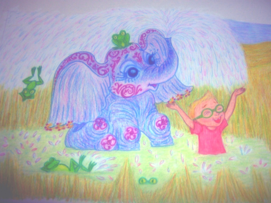
 A little more progress made on the illustration job. Here are pages 5-6. Photos really don't do it justice. (Sigh) I really like how the baby elephant turned out, with her lovely mulberry tattoos and golden earrings. The giraffe is a different take on the hottest item in my Etsy shop, a Purple Giraffe (seen below). I didn't want it to be exactly the same, so I went with a side view and a pinker color scheme. As it's a 2 page spread which the author wants presented as one scene, it's sometimes difficult for me to figure out how to illustrate both of the ideas seamlessly. It has to make sense as a whole scene, yet each also needs to stand out on its own. They also need to be large enough for the individual details to be seen. It's an interesting challenge on the perspective. This time I went with showing just part of the giraffe in the foreground of the 2nd page, so I could still do a full figured elephant.


Friday, March 23, 2012

Illustration Project: Pages 3-4

  Sooooo much work to do on this project! It takes me about 8-10 hours to do a completed drawing of this size, especially since I decided I didn't want a hint of space showing. Lots of color-layering and blending. I'm glad I chose a good sturdy paper, cuz it's gettin' a workout and , so far, hasn't worn thin under the pressure. It's Canson 70lb Drawing Paper (14 x 17). I chose it because it had e/g I was looking for, advertising itself as "suitable for final drawings, fine surface, erases cleanly, blends smoothly". I must say it lives up to its hype!

I had a bit of trouble drawing this one as the author was set on having an indoor/outdoor scene all-in-one, with the outdoor part being seen through a picture window. I had originally wanted to do it all in a garden, with giant sunflowers. It was hard doing it in such a way that the window wasn't disproportionately large for the room, yet large enough to display the characters outside. The dimensions are a bit odd (16.5 x 6")  so it presents a challenge. But I think it worked out well in the end, and I did manage to get the sunflowers in!

Some nice features (IMO) are the 2 kittens under the toybox. It's hard to see (thanks to my not-so-great photography and the paper being too large to fit in my scanner) but the little pink and fuchsia kitty has a cute curlicue pattern to its coat. I love the look of giving just a hint of them, with the focus on their kitten paws darting out to grab objects lying on the floor. Just the way real kittens do.


As usual, per my somewhat meandering process (I think the kinder term is "Organic") I never have all of the colors thought out completely. I sorta start somewhere and e/g else takes its cue and flows from there. The boy was the only character whose color was set in stone, as the author wanted her kids wearing their favorite colors. So, I started with adding purple to the dogs fur with a touch of cream on his brows. That set the tone. It led to the two kittens, in pink/grey and pink/black. Moving on to the next page, I tied it in with a pink/purple/cream mother cat and the two kittens under the toy box in variations of the same colors. The toy box picked up the colors of the boy's clothes, w/ a scrubby looking overlay of cream to give it a painted look and bright yellow lettering, just cuz it seemed bold was the way to go there. I introduced green in the garden, picking it up in the dino toys in the corner. I then went back to the boy's socks (which i hadn't decided on) and gave them a splash of green, too. The yellow sunflowers went nicely with the toybox, but I was determined to do them anyway!

To introduce a few things that were clean (not so busy) and give the eyes a break from the color extravaganza, I scattered things from start to finish (left to right) that were white, w/ the same defining dark blue to make them stand out. It starts with the paper planes hanging from the ceiling, the tennis shoe in the boy's hand, moves to the relatively stark blue and white of the curtains, and ends w/ the blue and white spotted dog. I'm also a fan of unexpected pops of red, thus the lady's shoe and the yo-yo.

All that was left was the background, and here I debated w/ myself, going back and forth in my mind, solid color or patterns? On my scratch paper, I experimented with a ginger and cream color background. Pretty but a bit bland. I added a wavy bright blue line and was sold on patterned wallpaper. Once I had it all down, I felt it could still use a little extra punch and added the bright green line. Looked good to me! Then I dressed up the floor with boards and grain and finally, put down my pencil. It had a finished look. There was n/g left to do but clean up the mess I made sharpening my pencils. (I have a trash can right under the desk, but I'm always in such a frenzy when I work, I invariably end up leaving a huge pile of shavings on the desk).

So, here it is. What do you think?


Monday, March 19, 2012

Illustrations Contd.


Progress is being made on the book illustration project.  This is a 2 page spread. It's rendered entirely in colored pencil. Originally I was going to outline e/g with black Copic pen, but decided it looked to cartoonish. I wish I was a better photographer, but I hope you get the idea. There are several touches of pure fantasy. For instance the alligator's skin; I knew I wanted to do s/g totally unexpected with it and somehow the floral pattern just sprang into being. I find it oddly appropriate. It's hard to tell from the photo, but the background is a a blend of swarms of butterflies, little green flying critters, flowers, leaves and vines. I wanted it to be interesting but not overwhelming, so I blended it all with a cream pencil as well as a blender.

That's all! Back to the Drawing Board! ;)

Monday, February 27, 2012

CATASTROPHE!

CATASTROPHE!

Or at least potentially so. This is my entry for the Doodlers Doing Doodles team challenge for the month of February. It's just a pencil sketch, with a little added text, so it's not for sale or anything - just for fun! And it's drawn from true life! 

We have a new pet, a HUGE orange tabby named Mr Vimes, who came to us by way of my son's compassion for the adoptable pets at PETCO. This fellow is older (about 3), a little "hefty", and perhaps not as cute and cuddly as the kittens, so he kept coming back, week after week, still looking for that home-sweet-home. My son (who just happens to work at PETCO) started talking about him weeks ago, and finally wore me down enough to go take a look. Needless to say (so why say it?) we took him home that evening. Later, our 2 Chis got their first look!

No worries! They're all mates now, though there's still a lot of chasing one way and quick running back the other! He is, after all, a bit bigger than they!

Illustration Progress Report

Just felt like telling s/one (lucky you!) about how my new illustrating job is going! I accepted the job several weeks ago for a children's book. I won't tell the story line, cuz it's not my story to tell, but I thought I'd share my process.

I don't know how others do it, but an illustration of this size (about 10 2-page spreads, plus a cover and various "spot" illustrations) takes me many months to complete (especially in conjunction with a day job). I do it in several stages.

STAGE 1 - Character sketches. This took me several weeks (mostly on the weekends) as there are 5 characters, 4 of whom are based on the author's children. So, altho I'm not a Portrait Artist, and these are not exact portraits, it was still important to the client that there was some resemblance. This took a bit of emailing pics back and forth and adjusting this or that ( the gap btween 2 front teeth needed to be larger, rounder cheeks, not so round on these two, etc.) but eventually they were all worked out. Phew!

STAGE 2 - Really sketchy sketches working on the layout on any paper to hand (envelopes, lined notepaper, the back of a bill...). This was done all along, whenever an idea and spare moment coincided. Sorry - no one gets to see these! They look like they were done by a 4 year old - all circles and odd shapes and scratchy lines meant to represent the characters and landscape w/out actually drawing them.

STAGE 3 - The initial drawing on the actual paper. This is what I worked on this past weekend. I chose a non-scan pencil for this as it's a little waxy - not much dust to make smudgies - and the lines are not supposed to show up on a scan. Still, it has to be done lightly, and not overworked as some will show through.

STAGE 4 - I go over all of the lines I decide to keep with Prismacolor pencils. I match the color of the lines to the actual color of the item (peach for outlines of body parts, brown for the tree trunk, etc.). I lightly erase the extra lines as much as I can. (Some still show, but will disappear in the final stages.) The examples you see here are completed thro this stage.

STAGE 5 - Layering in color (including adding patterns) and blending. Probably one of my fave stages. Scheduled for next weekend!

STAGE 6 - Coloring in the background if it's not going to be left white. (In this case it's not, and I have a special background effect in mind which I'll keep as a surprise!)

I thought I'd like to show my client the progression, as so far she'd only seen the character sketches and must have been out-of-her-mind w/ curiosity as to the actual illustrations. However, this is a one-time deal. I won't do this for every step or even every pic for a few reasons. One - the actual size doesn't fit in a home scanner - it's too big (16.5" long) so I have re-position & scan it several times to get the whole thing sent. Also at this stage I keep it in the pad for added protection and the spiral binding prevents me from scanning the whole thing. That's why you won't see all of one of the children - he's on the side where the binding is. Every time I scan, I take a chance on crumpling up the paper, which most likely would result in having to start over! Plus, an illustration in it's beginning stages can look scary w/ sketch lines showing and smudgies. If you're not used to looking beyond it to the finished artwork, it can make you think it should be scrapped! But, I thought I'd chance it all w/ this first one,just so she could get a little relief from curiosity!

And now I can share it with you, too!


That's all for now. Thanks for looking in.

Tuesday, February 7, 2012

Universes Collide!


   My good friend and fellow Doodler, Cindy, (from The Slumbering Herd) has been nagging - er, um, encouraging me to give Illustration Friday a whirl. Illustration Friday (IF) is a site that posts a weekly "prompt" for Artists to use as an inspiration for an illustration. Cindy has been quite persistent in her efforts, despite my equally persistent procrastination. Last week, her stubborn - er, um, I mean patient, efforts finally paid off and I submitted my first work of art.

   I'm hooked! It's really fun to see what twists other artists come up with in responding to the prompts. Many of them choose non-conventional and totally unexpected interpretations that lead to chortles and chuckles and other forms of merriment. Laughter is good for the soul!

   I also love getting a glimpse of someone else's imaginary world. It stretches the boundaries of my own little universe and inspires me to think and draw in different ways. Thus, my overly-dramatic title for this post...

  Anyway, I decided to enter my "Guardians of the Enchanted Forest" for this weeks prompt, "Suspense". You may have to look closely to see the Guardians. (Hint - they are not the little owls.) They are a bit camouflaged in the tree bark, altho I gave them a darker tone to stand out. Once you spot them you might notice their ominous glowing-green eyes and tense posture. Obviously they have someone under observation. Your guess is as good as mine as to what they have planned. Thus, the "Suspense".


Saturday, January 21, 2012

New Life - New Art


                               I like this new painting! The woman is looking forward to the future.


She is  determined  to create a life of her own choosing - forging a path through a sometimes confusing and seemingly chaotic universe.


She's not delusional - experience has taught her it won't all be Rainbows and Unicorns!


  Still, she looks forward to the challenges that lay ahead; wishing for strength and courage against the darkness; humility and grace in the golden glow of good fortune.


   To all who have wished me well upon my journey, I am so thankful for your friendship and good wishes. It makes all the difference in the world! I hope that I can do the same for you, should you be in need.

* I entered this painting in the weekly challenge over at Illustration Friday. It seemed to fit the topic for the week, which was "Forward".

Saturday, January 14, 2012

To New Beginnings...

   Am I too late, do you think, to raise a glass, to ring in the New Year? Please excuse me if I'm slightly disheveled and somewhat discombobulated. I know I'm late, but I'm finally here!

   And where exactly is that, you might ask - that is, if you still had any interest at all, after so long an absence; 4 months in fact! You might also ask (if you had noticed and were so inclined); "What's up with your blog?" and " Why did you change the colors?" and "Why did you change the name?"

   Well, it's a tale. You could also think of it as a tail; that seems to be a more accurate description of the accumulated experiences that have attached themselves to me, following me around wherever I go! (I digress. It's one of the perks of having no one to edit your remarks but yourself.)

   Since we last met, albeit (love that word) only internetically (a newly-coined word, soon to go global) I feel as if I've accumulated enough new experiences to put a few kinks and twists in my already-lengthy tale/tail. I won't bore you with the details (only with run-on sentences, self-indulgent use of extraneous vocabulary and frivolous comments) but you can suss it out by scrutinizing the following mysterious word clues!

Underwater (Hint: Not the wet kind. Think Real Estate)
Loss of Habitat (Hint: Some mammals require more square footage...)
Downsizing (I'm pretty sure that's a new-ish word. Might not be in the dictionary, yet. Maybe the Urban one...)
Migration (Hint: Some species move across an entire country, usually following a pattern dictated by the weather, loss of habitat and/or financial duress.)

   So, after a few twists and turns; I have a new home; 2 of my 3 dogs are with me ( a very sad paw-note is that my good old dog didn't make it, but she was going on 16, so...); some of my family is here, others are yet to follow; I've had a long-anticipated re-union with my parents and other loved ones; it's taken me awhile to get my art-butt in gear, but it's coming along with encouragement and support (ya' know, Etsy is a pretty nice community of folks); I'm looking for a job in Early Childhood Education because I love working with kids and need to help support my family; and I'm continuing to write and make art. And friends. :)

   But (you say) that doesn't explain the strange color changes on my blog, does it? Well, just chalk that up to "Artists License". I use that a lot. Mostly when I make mistakes. Let me know what you think of it. Is it too dark? For some reason I like the drama of both pale and bright colors against a dark background. Or does it look cheesy, like a velvet painting?


    Anyway, I hope you'll forgive me my tardiness and welcome me to the party. I brought some new art, just to say "Thanks for listening to my tale/tail" and for sticking with me all the way to the end!

   I hope you don't mind if the glass I raise is not the proverbial flute of bubbly, but a heavy, ceramic mug, full of piping hot cocoa. It's a bit nippier, here in my new habitat.

Thursday, September 1, 2011

My Other Love


  When I was a child (about 4 years old) I had two very distinct goals that I wanted to achieve in my life. They were my 2 loves. The first was to live life as an artist; writing, illustrating and creating artwork in general. I've pretty well covered this in previous posts. The other is yet to be shared.

  For some reason I got it into my head that learning was supposed to be fun! I suppose I got this from my father and mother who somehow taught me to read by the time I was 4. It probably had something to do with the well-written and beautifully illustrated stories which they read aloud, and the memorable trips to the library which seemed full of treasure just waiting to be discovered. It may have been the sense of wonder fostered by trips to magnificent parks with vast lawns of green and lush foliage in which mysterious creatures (like the wondrous "Walking Stick") could be found.

  Whatever the reason, I definitely thought learning was fun. Unfortunately, when I went to first grade at the age of 4 (kindergarten was skipped because I could read) I found, to my great disappointment, that school was NOT fun! I clearly recall walking around the playground with a scowl on my face (not the best way to encourage friendly overtures) thinking that this was all wrong, that learning should be fun, and when I grew up I was going to make it be fun! I imagined thinking up some new and wonderful way of teaching (the exact method was a bit blurry). The whole world would use it and every kid everywhere would have FUN! The weird thing was (well, apart from being 4 and thinking that way) I pictured myself doing this by the time I was in 1st Grade! Apparently, I thought all I needed to accomplish this was a year to work on it!

  That was possibly the first unrealistic target I set for myself (riding a black horse with a white mane and tail to school is another) and it wouldn't be the last. Alas, I'm still working on that!

  Anyway, although I obviously didn't make that target, it was an idea that followed me around, niggling me from some little-used portion of my brain. As an adult it resurfaced and resulted in various activities that I found very fulfilling. One of the first was becoming involved in the PTA at my girls' Elementary School. I was appointed the "Cultural Arts" Chairperson. Such a grand title! Basically, I was given the opportunity to create events and activities that brought the Arts into the lives of all of the children at the school! What could be better? I embraced it enthusiastically!

  One of my all-time favorite events was the "Arts and Crafts Fair". Although there was a little gallery, this was not just a showcase of artwork that the children made, oh no! This was a hands-on, make it on the spot explosion of creativity! Here are some of the Craft Stations we had set up in the "Multi-purpose Room" (otherwise known as the gymnasium);

1. Drawing on T-shirts; We had baskets of fabric markers in as many colors as I could find. I sent out numerous notices leading up to the fair, reminding everyone to bring their T-shirts and/or tennis shoes, but just in case someone forgot, I also had special paper available to make transfers. Volunteers had cut out pieces of cardboard to put inside the shirts and stretch them out. There were no rules, other than my all-time favorites of putting the cap back on a marker before taking another and no making fun of anyone's work!

2. Mask Making; This was a station where the kids could decorate pre-cut mask shapes. Volunteers spent several nights cutting paper plates in half and then cutting out almond shaped eye-holes. The table was laden with markers, feathers, beads, rhinestones, lace. fringe, pom-poms etc! Also many bottles of "Tacky Glue", a nice kid-friendly crafter's glue.

3. Cookie Decorating; Only 2 moms worked to bake literally hundreds of giant sugar cookies! Each child got one on a paper plate. We had plastic ketchup-type squeeze bottles filled with many colors of icing, and plastic tubs of sprinkles and shaped candy pieces (such as stars and hearts). I guess no one had concerns about too much sugar back then! Hey, it was a "special occasion"!

4. Found Object Sculpture; My personal favorite. We collected all kinds of "junk" for weeks beforehand. The parents donated everything. Before setting it out we went through it, made sure anything we put out was safe, and sorted it according to categories. Every child got a Styrofoam base and circled the table helping themselves to whatever caught their fancy. Bottles of good ol' Tacky Glue were placed at intervals around the table. There was also a few long tables where kids could set their sculptures to dry and display. It was a Super Recycling Project! I especially liked the ones made out of old toys.

5. Music Making; A few very imaginative parents built all sorts of funky percussion and string instruments out of cans, cylindrical oatmeal containers, varying levels water in bottles, and what-have-you. A very noisy station! In fact, making as much noise as you wished was encouraged! This station was set up in a room of it's own because we wanted kids to be as loud as they wanted without anyone shushing them.

6. Cooperative Mural; This consisted of a very long and wide piece of butcher type drawing paper taped up along an entire wall. Markers were provided at intervals and anyone could "draw on the wall". I think there might have been a theme, but I doubt anyone enforced it!

  These are all I could remember. There may have been a few more. We had a very active PTA and great Parent Volunteers - there's no way I could have pulled this off by myself! When the night arrived, it was pandemonium - but in a good way! It was extremely loud, but the noise was happy! Kids were running all around, going from station to station engaging in the activities. I remember taking turns manning the T-shirt table, the Mask-making, the Cookie Decorating and the Found Objects stations. It was SO MUCH FUN!

  And I have had so much fun re-living that experience that I'm afraid I've gotten a bit long-winded! So I'll end here and save the rest of this tale of my other love for another day (or two). Once again, thank you for visiting and listening. If you have had a similar experience or a favorite fun craft for kids that you'd like to share, please feel freeeee to leave a comment!


Friday, August 26, 2011

"Liebster" Love - Pass it On!

  
  A  few weeks ago I was the happy and humble recipient of the Liebster Award! It's an award that originated in Germany (I've since found out that "liebster" means favorite) to help people discover the hidden gems to be found in little-known blogs. It is awarded by a previous recipient; a fellow blogger who likes your blog and would like to share it with others. Each recipient then pays-it-forward by awarding it to 5 more bloggers whom they admire and would like to share with the world. ( You are not obligated to pass it on - if it's not your thing, no worries!) 

  The only rules are; 1. You thank the person who awarded you and link back to their shop; and 2. The blogs that you pass the award on to must have less than 200 followers. I think it's a great idea to help some of us lesser-known but totally worthy bloggers to be seen and heard!

  In my case,  Palomasea of Gypsy in Me (one of the bloggers I follow for her beautiful images and words of inspiration) passed the award on to me. If you haven't visited her blog, I urge you to do so! You will surely find something there (a beautifully presented picture or a simple yet poignant phrase) that will spark your own creative energy.

  It has taken me a few weeks to pass on the award, as I'm experiencing some interesting life changes (one of which is a decision to move cross country!) which prevented me from having the time to write an appropriate response and present the award properly. (More on that at another time!) So, without further ado, here are the blogs I have chosen. It would be lovely if you would visit them and comment on their work. They all have something in common; they are hard-working folk making time to create something beautiful, courageously putting themselves out there, generously sharing their vision.

 Diane of the Singing Swan; Folks, I cannot tell you what this awesome gal has been through and bested in her life as it is not my story to tell, but suffice to say that I admire her greatly for her spirit and courage. We met online a couple of years ago, and though we have never actually met in person (she lives on the other side of the country) I count her as one of my dearest and most treasured friends. She lives in a remote mountainous area and doesn't always have access to things some of us take for granted (like high-speed internet or sometimes even hot water). She is an amazing photographer, quilts, sews, draws, writes - and just plain has a unique outlook and common-sense wisdom that I love. She started a blog, and soon thereafter experienced computer woes, so there are only a couple of entries there. I think it would be so lovely if a bunch of folks were to visit her blog and comment upon it in the spirit of generosity, so that when she does find a way to check in, or better yet gets that dang computer (she likes to call it "confuser") fixed, she will have a wonderful surprise waiting for her there!

Cindy, of The Slumbering Herd; Simply put, I fell in love with her "Beasts"! She draws these wonderful, quirky, colorful intriguing creatures called Beasts, and my eyes and heart and mind just can't get their fill of them! She writes just a little bit of a storyline about each, which only serves to draw me further in to their mysterious life. We belong to a team on Etsy called Doodlers Doing Doodles (cuz ya know I love to doodle!). In the course of admiring her work and sharing conversations, we have become good friends. I so think her Beasts deserve a much wider audience! Go on, take a peek! Then come back and tell me how right I am! :)

Singleton of Just Give Me Peace; Ohhhh, this gal with her freewheeling imagination and generous peace-lovin' hippie spirit! She takes me back to a less conservative version of myself and reminds me to live the life unconventional. She is also a member of the fabulous Doodler's team and the founder of the "Porch Party". It's a sweet little place, filled with objects created in our shared imagination, where we can go and just hang out and dip our toes in its cooling rejuvenating waters. "Huh?", you say. Check out her blog - then you'll understand! But your life may never be the same!

Lilah from Vegan Food, Art and Music; This gal is a chef, an artist, has a shop on Etsy, and is a Mom! And yes, she is also a member of the fantastic Doodler's Team! I have a special affinity for her work as she also draws coloring pages. I love the quality of her drawings - the lines are light and airy and freeeee. A word about the recipes - just reading the last one (vegetarian pineapple upside-down pancakes) made me gain weight! (Okay, that's an exaggeration, but my mouth watered!)

Oh, shoot, I can only pick one more! Well it has to be.....
 Zenobia Southcombe; Zee is one of the first bloggers I met, who took me under her wing and showed me the ropes. She is an artist (I love her Pirate Ship painting) and a teacher and possessed of a generous spirit. She encourages other artists by showcasing their work and interviewing them on her blog. She introduced me to the notion of Guest Blogging, and then did a swap with me, wherein which she shared Facebook tips with my guests. She also interviewed me as an artist and posted some of my work. She is very passionate about teaching, which is something she and I have in common. But I must warn ye, she has a liking for pirates, so beware when you visit her blog, that ye not find yourself on the morrow, swabbing decks beneath a Jolly Roger, at sea with no land in sight!

Well, that is all for now. I do have some major changes occurring in my life, which I will share at another time, cuz this blog post is about my friends. Please visit with them and shower them with love and good wishes, as they are a good-hearted bunch!

And here's a picture, just for sticking around and listening! ("The Dragon's Tears" - from the latest Doodle challenge)

Thursday, August 4, 2011

Rose-colored Lenses


    I'm not a big fan of looking at life through rose-colored lenses. I like to think I'm more of a realist. I strive to see things the way they are, as opposed to the way I want them to be. At the same time, I lean toward optimism. I believe that I can create the outcome I envision and cause things to go in the direction I desire. I don't think this will all just magically occur because I wish it. I know there is hard work involved - that I have to do more than just sit back and dream a lovely dream. I know there can be detours along the way, not to mention outright obstructions, but I feel I will win through to the end if I just keep my eye on the goal and persevere. When something bad happens I try to learn from the experience, so I can avoid it in the future and incorporate it into my journey in a way that propels me forward. Sounds reasonable, huh? A winning formula for success! Not quite rosy, but perhaps a touch of mauve...

    So, in the interest of keeping things real and providing a clear and unobstructed view, it's time to reveal my flip-side. There are days where I just want to crawl back into bed and pull the covers up over my head. A storm moves in, bringing thunderclouds of dark negativity and it begins to rain, rain, rain on my little parade. Sometimes (I like to think most of the time, but I'm not an impartial observer) I grab my metaphorical galoshes and umbrella and slog my way through, shouting out mental words of encouragement; "This too shall pass! "Focus! Focus!" "Just get to work - what's next on the list?" "Don't give into that @#%^&*!" "Can't make a healthy omelet without  paying a premium price for cage-free eggs and separating the whites!" (Ok - I made up that last one just for fun :0)

But, there are times when I just give in to the dark side. I don't know why exactly. Maybe I didn't get enough sleep the night before. Maybe it just suddenly seems easier. Or, maybe life is just a big computer game and I used up all of my Magical Optimism fighting the Demonic Demons of Darkness and now have to die a virtual death and be re-born before I get any more. (I like that idea! Can I get a new avatar with a younger body?)

   Whatever the reason, suddenly it's a full-blown Pity Party just for me! The room is dark, but  nobody's there to turn on the light and shout "surprise". Oh look, there are banners! So uninspiring! "There's too much out there - you'll never get noticed!" "Nobody even knows you're there!" "The Universe is conspiring against you!" "None of this matters anyway!" "What's the point of even trying?"

   There are games to play, but they're a bit depressing.  Act Like You Don't Care About Anything; that one's almost too easy - a child could play it. Nothing Can Make You Smile; always a crowd-displeaser. You don't even have to dress up! In fact, it's best just to stay in your pajamas. No need to take a shower or comb your hair either - why bother? It's the perfect costume for the "Nothing Really Matters"party theme!
 
   (Ahem.) Is it too late to pretend I didn't just write that? Cuz, I'm thinking maybe those rose-colored glasses aren't so heinous, after all. (Sigh.) There was a reason I wanted to write this - now what was it?

   Oh yeah! I wanted to share my journey with you, but it's not a true picture if I don't let you in on the hard times involved. If I just pretend everything is rosy it's of no use to anyone. The hard truth is that my decision to quit my day job and try to make a go of it as an artist and writer is hard on my family finances and it does cause me stress. Sometimes I deal with it just fine, and sometimes I don't.When I don't there are a few things that I have found helpful;
1. Do NOTHING. Ride it out. I literally (or figuratively, depending on where I am) send myself to my room! Just like a real storm, eventually the clouds dissipate or roll on and I venture out again.
2. Avoid snapping at anyone! Say nothing destructive. Fewer awkward apologies later!
3. I snuggle with my dogs and tell them my troubles. They are very good at listening, keep their comments to themselves, and possess a magical quality that dispels darkness faster than anything else I've tried!
4. I don't beat myself up afterwards for feeling the way I did.
5. When it's over, I create something. ANYTHING!

 Well, that's all about that! Sorry about those rose-colored glasses. I think I just heard the crunch of glass under my heel...

And here's a new work of art just for fun and to say thanks for listening!


And here is my therapist, Honeybear. She's licensed.


Saturday, July 23, 2011

Promoting Your Business on Facebook by Guest Blogger, Zenobia Southcombe!

Today I'm happy to introduce you to an awesome artist and teacher, Zenobia Southcombe. She is here to share vital information on how to set up a Facebook account for your Art (or any other) business. This is the kind of tutorial I was dyyyyying to have when I first ventured out into the Social Networking World! In fact, I'm sure there are things I never did quite get, so let's read this and learn together, shall we?

Using Facebook
  This article is to help you get started with Facebook to promote your Etsy art / craft business. However, it would also be useful if you are using a different platform to sell your art. There are a lot of articles online that can help you grow your Facebook page (so there’s really no point in writing another one!), and Facebook also has a lot of tutorials itself (you can find links at the end of this article). The aim of this post is for people who are new to Facebook, social media, or online promotion.
Getting Started
1.        Make a Profile Page. You need to do this before you do anything else on Facebook. This is simple to set up, you just need to go to http://www.facebook.com enter the basic information shown below, click “Sign Up” and you’re done! You can then edit your profile, add photos & videos, and add your links.


2.       Make a Fan Page. This is your art business page that people can ‘like’ and share with their friends. On the left-hand column, you will see a clickable link “Pages” with a little orange flag.

Click on this, and at the top of the page is a button “+ Create a Page”.

You need to then choose whether you would like to market your page as a ‘local business or place’ or ‘artist, band, or public figure’. When you click on the chosen icon, it will ask you for more information. If you chose ‘business’, you need to enter the category and physical address of your business (so choose this option if you have a physical shop or open studio as well as your online business). If you chose ‘artist’ then it will ask for a category and name – it is very important to note that the name of your page cannot be changed! So choose carefully.
Click ‘get started’ and you’re done -  a series of pages will pop open, and Facebook has some very clear tutorials about how to add & edit information and photos.

How can I connect with Etsy & my Blog?
1.       My Esty. This app links straight to your Etsy store, and shows your banner, items, pricing, and a button to click to go to your store.

You can find this app here: http://apps.facebook.com/myetsy/?ref=ts
*Note that when you add Apps, you will be asked to log in as yourself, not your fan page. Once you have added all the apps, you can switch back to your fan page by going to Pages > Switch.

2.       Add a ‘like box’ to your website and blog. If you are on Wordpress add a “Facebook Like Box” Widget, paste in your page’s URL, and you’re good to go! If you are on blogger, go to this site: http://developers.facebook.com/docs/reference/plugins/like-box/ plug in all the information, and you will get an HTML code. Then go to your blog, add a HTML / Javascript Gadget, and paste in your code. All done!
Where to next?
The following links will help you go further with your page:
This is the absolute go-to for Facebook page help! I suggest that you take a while to read through some of the information on there, and refer back to it as your page grows. I highly recommend looking at the “Pages Guide for Businesses” when you start up.
If you haven’t heard of this duo yet, I advise that you get to know them! They run a show that can be downloaded from their site or through iTunes, and have a wealth of information to share. They have done a few sessions about Facebook, and here is the link to find these: http://artistshelpingartistsblog.blogspot.com/#uds-search-results. The great thing about these is that you can listen as you work!

*********************************************************************************

Thank you, Zenobia! I certainly found that helpful and will be reviewing my own Facebook set-up with your advice in mind!


Please visit Zenobia at her blog and her Etsy shop, and leave a comment to let her know her help is appreciated! 
http://zenobiasouthcombe.wordpress.com/
http://www.etsy.com/people/ZenobiaSouthcombe


Monday, July 4, 2011

Artwork Revisited

Warning - Heavy Verbiage - No pictures till the end!

It's not very often that I go back and re-work something I've created before. This has to do with the way I work. When the inspiration hits me to create something, I often work in a frenetic, in-the-moment, spontaneous fashion, as opposed to an organized, steady, planned approach. It's as if the artwork itself is alive and eager to be seen - and it's very demanding! It has a lot to say and, since it's in my head, it's rather hard to ignore! In fact, lately I've noticed that I actually hear a voice. I'm sure it's been there all along, but now that I'm concentrating on creating artwork every day, it's gotten rather loud!

Now, don't get excited - It's not like it's "God" or my deceased Grandmother speaking to me from the other side, guiding my hand, or anything like that. I think of it as my "Inner Artist's Voice". During the creation process, we have lovely little chats, the Voice and I. You know, an inner dialogue. Surely, I can't be alone here. Other Artists must hear it as well. Or, I'm crazy! I'm okay with that. I like being able to hear myself think!
 
Often, the conversation is about finding hidden significance in the artwork. Apparently, sometimes I subconsciously put things into it and don't realize they are there, until the Voice points them out! ( Huh. I thought I just randomly sketched the hand that way. No - it's clenched for a reason!) Sometimes the Voice draws my attention to random thoughts, stirred up by the creation process, that blossom into realizations about the meaning of life and my/our place in the Universe. (Oh, I see. Sheesh! There are lessons everywhere.) Often, the Voice has a story to tell about the background of the characters in the work. (Alright, alright, I'll note it down so I can write the story later!) Sometimes we discuss how others might react to the work. (I usually get carried away and think it should hang in a museum. Invariably, the Voice cautions me to focus on being inspired by the work itself, not on imagined fame and fortune!) And of course, the Voice insists that I keep on working till it's done; following me into the kitchen ( I'll just get a quick snack and get right back to work.); around the house (I'll just get dinner going - I can work while it's cooking.); to bed (I can't keep my eyes open anymore. I'll get up at 5:30 and get right back to work!). I tell ya, the Voice sure knows how to get that artwork done!

Eventually, as more and more of the artwork is transferred to paper or canvas and less remains inside my head, the Voice has fewer remarks to make, and my pace will slow.  Finally, it all comes to a halt after the Voice and I spend a little time looking here and there for something to add or tweak and we both come up empty.  Then, we're done; the Voice, the artwork and I. Our conversation is complete. There is nothing more to be said. Finis.

It sometimes happens that later (could be days, could be years) I see something in a finished piece that I suddenly wish I had done differently. It bugs me a little, but I don't usually go back and re-work it. It's hard to explain why. To me, each piece of artwork is more than just the solid object I see in front of me. It's also the physical manifestation of all the thoughts and energy that went into creating the piece at that time. The spirit with which it is infused is what I had inside of me then, what inspired me to make it the way I did. The time for its creation is past. I don't like to mess with it. Does that make sense to anyone else?

That being said, there were a few times I did attempt to go back and re-do a couple of things. They were acrylic paintings that once hung proudly on my walls. Now they are leaning against a wall in storage. I keep them to remind me of my folly!

Despite that, this past week I found myself re-visiting a piece of artwork I had done a couple weeks ago. You may remember it. It was an Etsy Team challenge based on the theme "Midnight in the Garden of Good and Evil". The original idea pretty much popped into my head and frantically drew itself on the paper. I colored it in a frenzy. I remember thinking, as my hand flew back and forth across the paper that it was an "Expressionistic" way to apply color. I felt exhilarated while doing it, and exhausted when I was done. Because of the manner in which I did it, it had a sketchy look - but I liked it. I thought I was done and moved on.

Well, apparently it was not done with me! Off and on, throughout the week, I could hear the Voice calling me; "Look here, there's more to do!" Thoughts about it and images popped up unexpectedly. Intrigued, I kept picking it up and looking at it, and clicking on the online picture to view it there too. Finally, I said; "Okay, I'll do more work on it. When I have time. After I finish this that and the other thing." I put it on a list.

The Voice was not satisfied. Apparently, putting the work on a little shelf in my mind for later was not what it had in mind. I moved it up to the top of the list.

As it turned out, I did have more to do with that drawing, and it had more to do with me! The Voice was right to nag me. I liked the original idea of the girl walking a path through a Forest, the trees dark and tangled on one side and filled with light on the other. I liked the idea of the fork in the path and the choice to be made about which path to follow. I liked the idea of her face having the look of a Yin-Yang symbol on it - half white, half black. So there was nothing about the drawing I really wanted to change. I was just going to give it more definition, fill in more color, and make the dark and light aspects really stand out. Ok - basically it just needs more coloring.

On the surface, that was true. But it turned out to be so much more than that. In fact, I think it was not so much what I had left to give the drawing, but what it still had to give to me. For example, as I colored the girl, I noticed how I had drawn and colored her in a very ghostly fashion. Without really thinking about it, I was illustrating the idea of a struggle of the spirit, rather than one's corporeal self. I noticed how the hand on the "light side" was open and reaching out, while the dark-side hand was clenched in a fist. The light-side foot likewise stepped forward, unnaturally elongated to emphasize the point, while the dark-side foot was planted firmly on its path. As I colored the dark-side trees and brambles, I added deep shades of purple and blue and randomly thought to myself how beautiful the dark side was. ("Aha!" said the voice. "Think about that." I did.) In the end (when the Voice fell silent and I really was done) I understood (on a very personal level) how the drawing illustrated that the inner struggle, in itself, is an integral part of our spiritual growth, as individuals and as a species.

And now my Writer's Voice (What? Is she Sybil?) has fallen silent. Apparently I have said all there is to say about that. So, without further ado, here are the two images. The first "Midnight in the Garden of Good and Evil" and the second, which I named "The Dilemma". I enjoyed my time with it. I hope that you do, too!

Midnight in the Garden of Good and Evil

The Dilemma  (See it in my Etsy Shop)


Thursday, June 30, 2011

Lessons Learned (Or the Saga of The Mermaid Huntress)

When last we met, I was preparing to take the Mermaid Huntress through the last stages; finishing up the layering of colors and refining lines overall, then adding a nice blue watercolor wash. Remember when I said that sometimes things don't work out, and if they didn't I would be philosophical and shrug and say "Oh well, I learned never to do that again"?

(Sigh) Things did not work out. I was not entirely philosophical.

At first, everything went well. The final layers of colors came together and I was pleased with the result. Next came the experimental part - the watercolor wash. I like watercolors. I like the fluidity and the effects that can be achieved with washes and letting a bit of the paper show through here and there. I love using pearlescent watercolors over ink in my fantasy work. But I've never mixed them with color pencil. So now, why would I take the chance when there was a deadline (all of the Team challenges have to be finished by midnight on Friday) and when I'd publicly (that would be you!) promised to display it?

Well, a challenge is about stepping outside of your comfort zone, expanding your horizons. Doing a Mermaid in color pencil is something "right up my alley". I've done lots of them, probably in the hundreds in my lifetime, so far. In fact, I added some to this blog  to add a bit of color and break up all the verbiage! (These particular Mermaids are either on my website now, or were recently sold. They are all small - only 3.5 x 2.5" - done as Artist Trading Cards.)

So, "Mermaids" not necessarily a challenge. To change things up I decided to do a 9 x 12' drawing, giving me space to do a full scene rather than a small vignette. The idea came to me almost immediately. I wanted to do something that showed a Mermaid, not striking a stylistically, beautiful pose, but doing something I imagine she might do to survive in the sea. I wanted an element of danger, as I imagined there would be in an ocean full of predators. And then I saw her quite clearly, pressed back against a rock, tensed for a fight (to the death if need be), a Mermaid Huntress following the shadow of a Great White overhead.

I drew it in pencil rather quickly, with the image fresh in my mind. As I began planning the colors, the idea popped into my head that a wash of blue water color in the background would give it the right look - after all it was an underwater scene. I could have left it at that, and just filled in the background with watercolor. Easy enough to do. But then I had the idea to wash the whole thing with blue watercolor. I thought it would be beautiful if the entire picture had a blue overlay so it would really look like it was underwater. (Sigh)

So there I was, with a nicely colored drawing - all the colors looked just right. Instead of coloring it solidly as I usually do, I left a little paper showing through here and there so the blue watercolor would soak in. Time for the wash. I did hesitate. After all, it looked nice the way it was. All I had to do was color the ocean with color pencil. I knew that would turn out fine - I'd done it countless times before. What if this wash messed it up? I wouldn't have time to start all over...

This was about challenges, right? I got out my watercolors. The pearlescent ones. Thought they'd add some shimmer and shine. Oh dear. The blue is looking grey. Well, I'll just add a little more to deepen it. Gasp! What's happening to the Mermaid's pale skin? It has grey spots all over it! Oh no - whatever makes the watercolor pearlescent is giving the Mermaid speckles! And there are grey streaks all over the picture. This isn't going well at all! Blot, blot, blot with paper towel! Try adding regular watercolor! Oh no, the paper is too wet - it's going to scrub up if I add more! Ugh! It's ruined!

I (literally) put my head in my hands and considered the consequences. It seems silly now, but I truly despaired. I felt all kinds of yucky emotions; sorrow that I'd ruined something beautiful, disbelief that I'd poured all of that energy and creativity into something only to have wasted it, shame that I'd felt so smug about doing a Mermaid challenge, embarrassed to publicly admit I'd made a mistake, and hopelessness. I gave up. I decided to go have a late lunch (somehow the day had slipped away and it was waaay past lunchtime) and think about it later.

Eventually ( a little food and some time helps) I began to rally. I was sitting on the couch, watching some mindless TV show, determined not to think about my mistake, when little by little I started to climb out of the gloomy depths. A thought came to me - maybe I could still do something with it. Another thought - maybe it was still salvageable. Another thought - I owed it to the work to try. Another thought - it couldn't hurt - it was already too late to start over, so what could I lose but a little more time. It was as if the drawing was calling out to me, from the spot on my art desk where I'd (sob) abandoned it. I actually kept sneaking glances away from the TV and toward my desk where it lay. Finally my mind reached the tipping point - more thoughts collected on the artwork side of the scales and fewer remained on the TV. Click! Decision made - TV off. I went back to the desk, a little wary of what I would find there.

Well, it was bad, but not as bad now that it was dry. I looked at it as if it were a patient. Symptoms; grey speckles on the Mermaid's skin, drawing of shark obscured, overall color washed out, watercolor wash splotchy. Diagnosis: Original drawing sound but obscured by bad color. Treatment - fix the color. Prognosis - 50/50. :)

So I started in refreshed, even a little excited about the challenge! I was at peace with the thought that it still might not work out. I didn't mind admitting that I'd made a mistake. I no longer cared what anyone else might think. All that mattered is that I give it my best effort and if it worked - hooray! If not, I would take stock of what I had learned, and share that with others.

First order of business - the Mermaids skin. Now that the paper was dry, it turned out that a fresh application of color pencil took care of the speckles! Say, that meant I could do the same for any other object that was washed out! Here you go, Shark! A  little darkening of your original color and voila! You look marvelously menacing! Here you go plants! Let's brighten up your leafy parts and add a little definition - nice! Hey, rocks, lets' deepen that nice purpley color a bit, so you'll make a better backdrop for the Mermaid - let's make her pop! Oh, what fun! I get to re-do the swirls in the Mermaid's hair! Always a favorite thing to draw anyway. Gee, your hair actually looks better - terrific!

Yeah, but what about that awful splotchy watercolor background? Well, on closer inspection it's kinda cool, cuz it pools here and there, just like water. Dirty, muddy water. Hmmm. How about I take my good ol' trusty color pencils and enhance this effect? Let's see - dark blue in the pools, white swirls to highlight the eddies... Gasp! Look at the cool effects! This actually looks good! Much better than the wash I had envisioned.

The picture was saved! And, I had learned something after all. With art, it's not always just about the result. It's also about the process. Not everything works out - but everything you try tells you something about the materials and about yourself.

Without further ado, here is the final result: 

 Ok - that's done! What's next on the list?